YWR: Killer Charts
This month’s Killer Chart slide deck came out at 73 charts.
BofA Fund Manager Survey Highlights
S&P 500 Earnings Estimate Charts
Other Market Charts
China Charts
JP Morgan Market Insight Charts
A link to the full presentation is at the bottom.
Below are 10 charts which stood out.
The inflation outlook is historically low.
Same with the interest rate outlook. In the past these readings were associated with an imminent downturn.
‘01, ‘08, March 2020 were all crashes.
Yet estimate trends are stable.
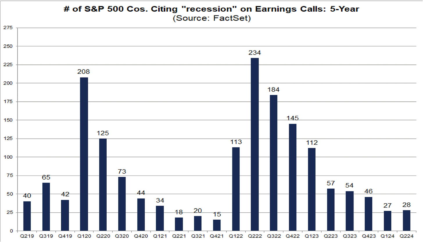
No mention of recession on earnings calls.
But some warning signs in credit card and auto delinquencies.
Other parts of the US business cycle are ‘average’ and don’t seem especially concerning.
Of all the asset classes Treasuries screen as the best value relative to their history. No one is saying to buy US Treasuries….
Yields across fixed income at the end of July.
Chinese car companies are wiping the floor with foreign brands. Could this trend spread to the rest of the world?
Is this China capitulation?
Bonus Chart! How much analysts love their job at Goldman Sachs.
Make yourself a coffee this weekend and check out the other 62 charts.
Below is the link to the full presentation.
It’s also available in the www.ywr.world library with the other presentations.


