
YWR: Killer Charts

Friday’s are great anyways, but aren’t they even better when you get your monthly Killer Chart pack too?
February’s 45 slide deck covers:
Private Equity software exposure
S&P 500 Earnings estimates
Strength of US Retail Investors
BofA Fund Manager Survey highlights
AI Labor Disruption paper from NBER
Mystery Multi-Asset Opportunity.
The full slide deck is at the bottom of the post, but here are some highlights.
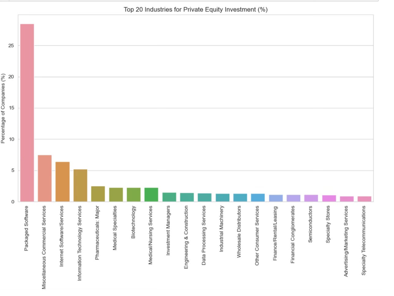
#1 Private Equity’s 34% exposure to software.
We’ve been saying for years the late stage rush into private equity was going to be a train smash (Anatomy of a Private Equity Train Smash), but we didn’t anticipate PE would also be on the wrong side of AI.
We analysed the sector exposure for over 46,000 PE&VC holdings.
The software exposure is amazing. 34%!!
28% of PE&VC holdings are classified as ‘Packaged Software’ with another 6% classified as ‘Internet Software Services’. Note, this is by number of companies, not value.
The chart pack also shows the Bottom 20 industries for PE exposure. As you would guess, the least favorite PE industries are exactly the HALO (hard asset, low obsolescence) industries investors now want to own.
#2 S&P 500 EPS Growth is Accelerating
There is so much noise around around whether AI is going to be bad or good for the economy, and whether there will be an unemployment spike which will cause defaults, etc, etc. etc.
But we have to remember we are investing in stocks, not the economy, and our North Star through all of this is to watch EPS estimates. Corporate earnings are where the rubber meets the road.
And earnings are looking really good. Like best ever.
Earnings growth for the S&P 500 is accelerating! Earnings are expected to grow 14% in 2026 and 13% in 2027.
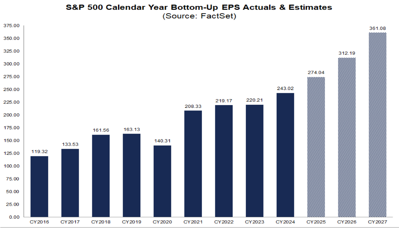
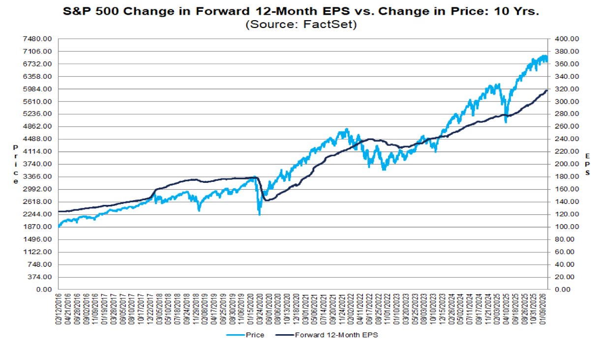
Over the long run the S&P 500 follows earnings.
Just for fun put $360/share, 8% ERP (5% 10yr + 3%) and 5% growth with in your Gordon Growth model and see what happens.
#3 Energy is already pricing in a recovery.
We’ve are bullish energy ($200 Oil pops the bubble), but it’s surprising how fast investors have moved to price in the energy recovery. The US energy sector is already trading on 20x forward earnings. Maybe play the European energy stocks instead. I own Total (TTE).
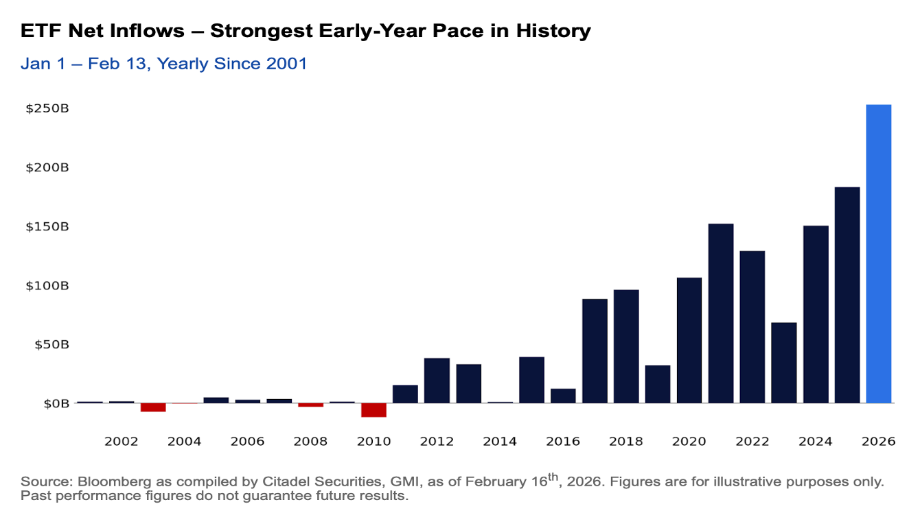
#4 Strongest ETF inflows ever.
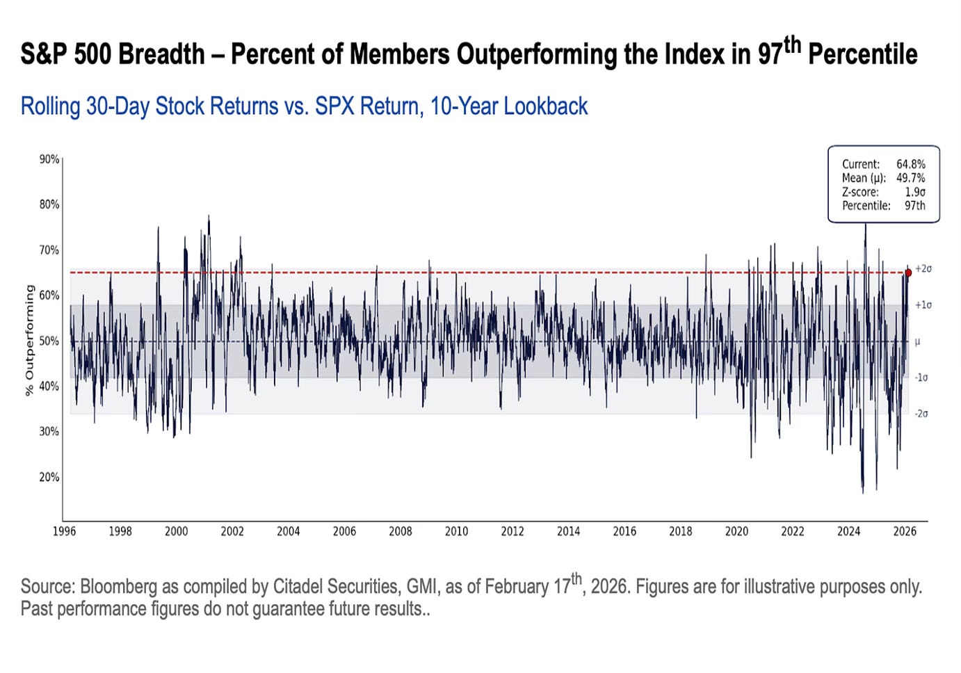
I included some great charts from Citadel Securities on the surge in US retail trading activity. US retail is more active than ever and I don't think it’s a contrarian indicator, at least not over the longer term. In fact I’m starting to think retail investors are outsmarting the institutional investors. They are better at adding risk on the lows.
One chart that stood out was that we’ve had the biggest ETF inflows ever for the start of a year. One the one hand this is exactly what we should be seeing with Project Zimbabwe, rising allocation to risk assets, but on the other hand it could be cautionary that we’ve had a good start to the year and might need to take a pause.
#5 Mag 7 are underperforming
The market performance is finally starting to spread out into other sectors like energy, refining and industrials.
The chart which shows this is the % of the S&P 500 represented by the top 10 stocks. The top 10 stocks are down to 36% of the S&P 500 from 40%.
We expect this trend to continue and Untouchable #9 is our way to play it.
#6 Sell in February and come back in May?
While the EPS momentum flagged earlier is a positive backdrop the combination of super strong ETF inflows and elevated fund manager sentiment suggest the next few months might not be as fun.
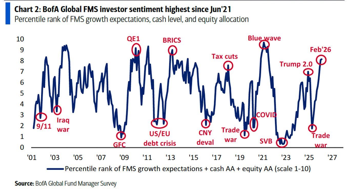
The FMS cash level chart is also flashing a warning sign.
Maybe by May we are ready to go again.
#7 Is the Great AI Unemployment Disruption just 3% of jobs?
The NBER published a paper by Sam Manning and Tomas Aguirre which tried to bring something new to the AI-job disruption fear.
Manning and Aguirre measure which jobs are most likely to get disrupted by AI, but also which workers are most likely to be able to adapt as well because they have a high level of education and income (top right quadrant)
They then identify the occupations with a high risk of AI disruption, but where workers have low incomes and might have a harder time adapting (bottom right quadrant).
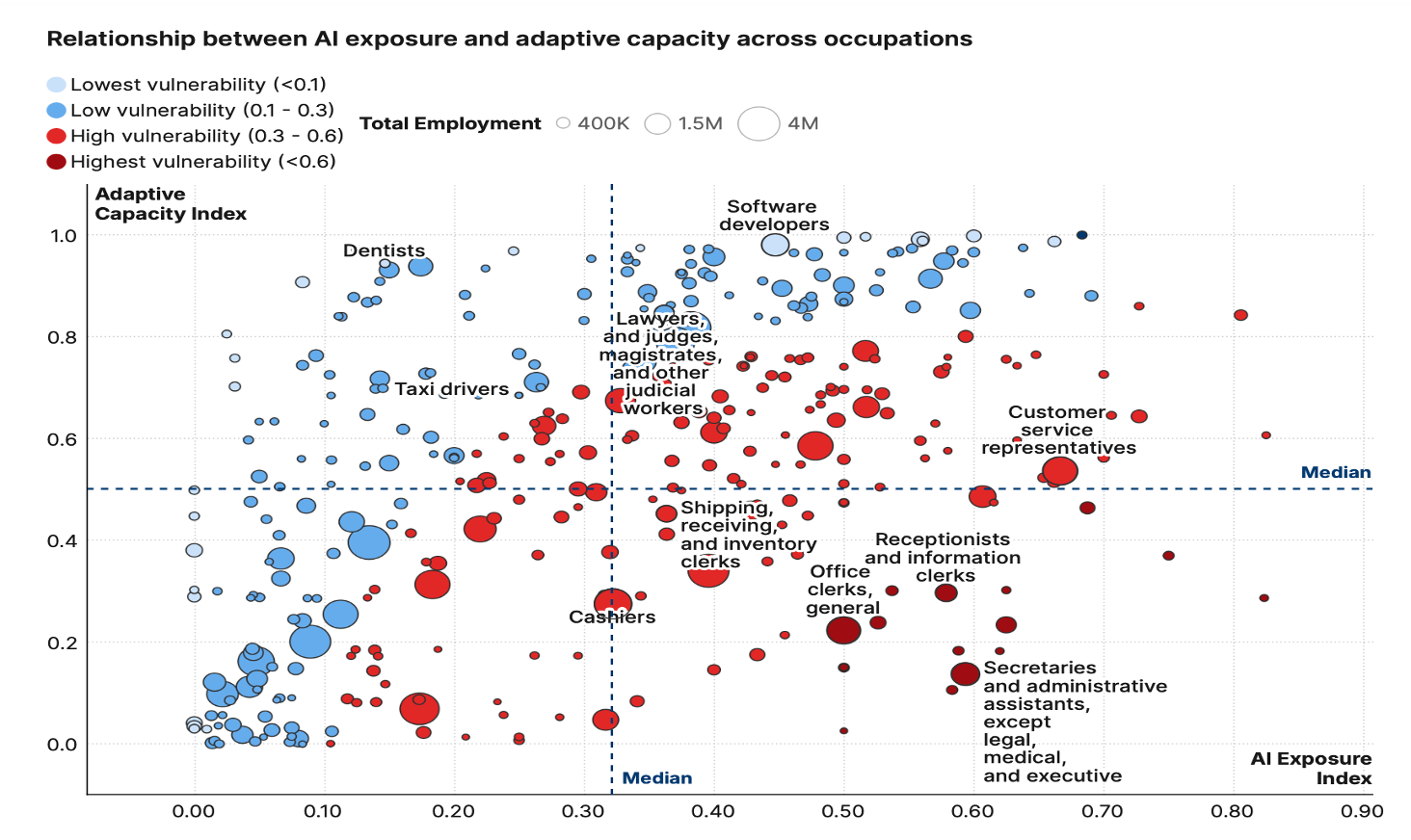
When Manning and Aguirre map the % of workers with both high AI exposure, and low ability to adapt, it averages out to 3-4% across the country.
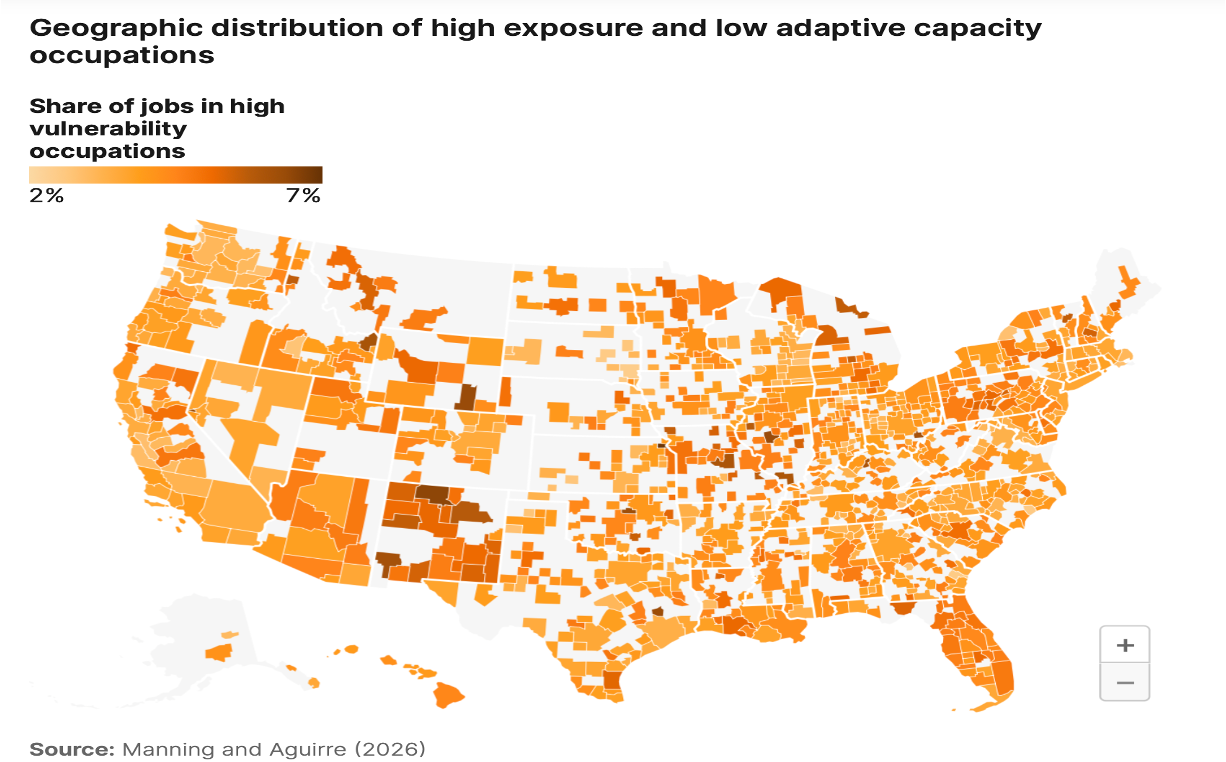
So do we get a 1-2% increase in unemployment, but the overall effect on the economy is not that high?
In the chart pack you might be interested in occupation #4 in chart of the Highest AI exposed jobs (‘but with high adaptive capacity’).
A link to the full chart pack is at the bottom.
#8 Mystery Multi-Asset Opportunity
Are you interested in something completely off the beaten path?
Well not that far off the beaten path, but something nobody is talking about.
Can you invest in other assets besides traded securities?
It’s not exactly a dripping roast, but it’s interesting, because it rarely looks attractive.
